

OVERVIEW
CONCEPT
This project is a website redesign project that aimed at improving registration events and donation process, providing users with a high quality and convenient user experience.
INTRODUCTION
The UFAA website redesign project is a collaborative effort by several groups at Center for Digital Experience at Pratt Institute. In this project my team (Akshata Karekar, Ruhee Shah, Jichen Zhu, Kira Zimmerman) improves user experience by making the online donation process more intuitive, introducing attractive Events and Events Details pages to the UFAA website, and tailoring the event RSVP process to user needs.
DURATION
15 weeks,
Teamwork
SKILLS
UX Research, UX Design, Visual Design, Prototype,
UX Testing
MY ROLE
UX Designer
UX Researcher
TOOLS
Miro,
Figma, Illustrator,
Photoshop
ABOUT THE CLIENT
The Urban Fellows Alumni Association (UFAA) is a not-for-profit organization for former participants of the New York City Urban Fellows (UF) Program, including former fellows and supervisors of fellows. We are committed to sustaining an active network of alumni who support each other socially and professionally. UFAA organizes regular seminars, social events, and other opportunities to meet alumni, current fellows, and prospective participants in the NYC Urban Fellows Program.
CHALLENGE
How might we provide users with a concise, convenient and fast user experience of RSVP events and donation, so that users do not need to switch between multiple website platforms.
PROBLEM
All events on the current website only appear in the form of headlines and there is no detailed event introduction.
1.
All events on the current website are displayed on a list, which is very troublesome for some users looking for events at a specific time.
2.
Users on the current website need to use other platform to RSVP events through external links, and sometimes they cannot view/edit orders after registration.
3.
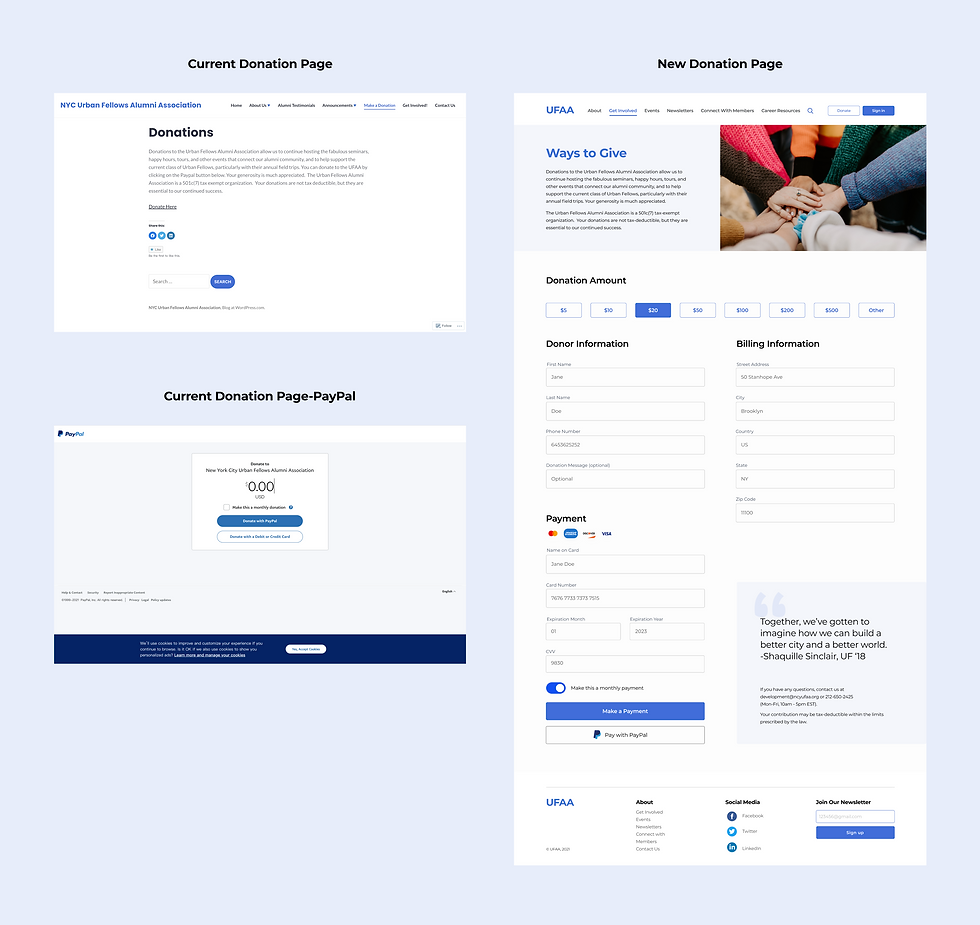
The current website's donation process is very simple and fast, but only provides PayPal as a payment method.
4.
SOLUTION
1.
Design a display of all events in the form of a combination of pictures and text. Each event has a detail page showing all the specific information about the event.
2.
Design an event calendar interactive page where users can search events by setting the date.
3.
Provide a convenient and quick use experience for RSVP event on the UFFA website, and users can view/edit orders at any time after registration.
4.
Provide users with a variety of payment methods and suggest the amount of donation options.
RESEARCH
INTERVIEW
In order to get to know our audience and users better, we conducted eight rounds of virtual interviews and did data collection / analysis. Interview scope spanned user background, user engagement with the UFAA network, and user visualization of how the UFAA could better meet their personal and professional needs. We want identify specific user needs for example:
-
Can the user reach out to other alumni members easily through the website?
-
Is the user updated on the recent events of the UFAA through the website?
-
Is the user aware of how to virtually connect with, to get involved in events hosted by the UFAA?
.jpg)
PERSONA

COMPETITIVE ANALYSIS
Our team reviewed eight competitors’ websites in order to assure that our final deliverable follows best industry practices. Our study evaluated the performance of each competitor site based on their homepage, search, organization, content, navigation, appearance, features, and links and labels. We concluded this analysis by compiling key insights about competitor sites.

After the data analysis, we propose the following takeaways:
-
It is essential to make sites attractive and well-organized
-
Networking features need to be user-friendly to be useful
-
Successful site navigation depends on clear links and labels
-
Visual elements can make or break brand trustworthiness
INFORMATION ARCHITECTURE
CARD SORTING
Card Sorting is a technique in which users are asked to organize information into logical groups. Users are given a series of labeled cards and are asked to organize and classify them into groups they believe are appropriate. Using Optimal Workshop, we created 20 cards and six main categories including “Events,” “Newsletters,” “Get Involved,” “Career Resources,” and “About UFAA.” We invited 12 participants to take the test, and 11 of them completed it.

After collected Card Sorting results from 11 participants, we firstly used the standardization grid function to sort card ranking for each category and put cards that the majority has agreed on in the tree testing model. Then, we analyzed the results of the controversial cards and summarized our findings:


TREE TESTING
Tree Testing is a way to evaluate the proposed sitemap by asking users to find items based on the organization and terminology of the site. It is done on a simplified site structure, text version – without the influence of navigation aids and visual design. We created 8 tasks for the 13 participants we surveyed.

After collected all Tree Testing results from 13 participants, we conducted data analysis and summarized the following findings:


REVISED INFORMATION ARCHITECTURE
Based on the findings of Card Sorting and Tree Testing, we redesigned the Information Architecture for the UFAA Website.

MVP
Our team decided to set the MVP of the project in the Events and Donation modules. The goal is to provide users with a concise, convenient and fast user experience of RSVP events and donations.
TASKFLOW

WIREFRAMES
SKETCH

DESKTOP VERSION

MOBILE VERSION

USER TESTING
OVERVIEW
Our team invited a total of nine participants to conduct user testing, and they were asked to complete the following tasks:
-
Take a couple of minutes to browse the homepage. Tell me what you think this website is about and what you can do on this site without clicking on anything yet.
-
Find the Event “NYC UFAA Annual Alumni Reunion Party” and sign up.
-
Add this event to your Google Calendar.
After nine rounds test, the participants pointed out that prototype's overall flow was smooth and there were no major logic or usability issues. But many details still need to be worked out, and some pages need to add more user options.

ITERATION


KEY SCREENS
1. HOMEPAGE
The content of the homepage of the current website is monotonous and lacks visual elements, and even a picture is not displayed, which is not attractive to users. On the new version of home page, we added an Upcoming Events sub-heading because during user testing, the first place users searched for info about events was the homepage body text. We also added some visual elements to the homepage to make the website have a better visual effect, allowing users to have a comfort visual experience when browsing the website.

2. EVENTS PAGE
All events on the current website only appear in the form of headlines and there is no detailed event introduction. We designed a display of all events in the form of a combination of pictures and text. Each event has a detail page showing all the specific information about the event.

2.1 EVENTS PAGE - FILTERS & SEARCH
In the Events page, we added the filter function, users can select the events they want to participate in by category, format and location. We also added the search function, which is conducive to those users who want to search through keywords to find events quickly.

2.2 EVENTS PAGE - EVENTS CALENDAR
All events on the current website are displayed on a list, which is very troublesome for some users looking for events at a specific time. We designed an event calendar interactive page where users can search events by setting the date. We also added an interactive effect that allows users to preview the image of the event when their mouse hover over on a date where an event is displayed.

2.3 EVENTS PAGE - RSVP
Users on the current website need to use other platform to RSVP events through external links, and sometimes they cannot view/edit orders after registration. We provided a convenient and quick use experience for RSVP event on the UFFA website, and users can view/edit orders at any time after registration.

3. DONATION
The current website's donation process is very simple and fast, but only provides PayPal as a payment method. We provided users with a variety of payment methods and suggest the amount of donation options.
MOBILE VERSION

PROTOTYPE


PRESENTATION
THE CLIENT WAS IMPRESSED!
